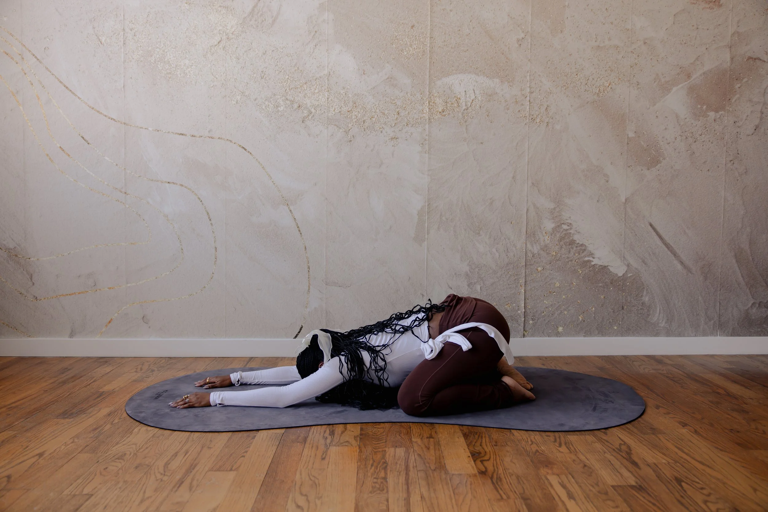
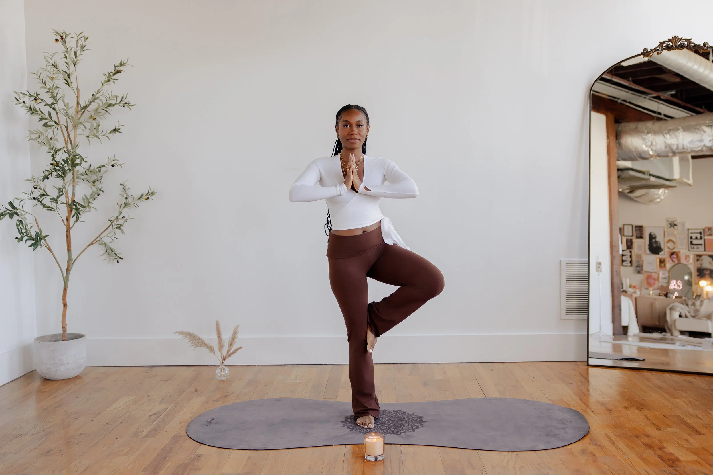
Solo+

Travel App

A place for travelers to connect.

Solo+ is a mobile application created to connect solo travelers with other solo travelers in their desired location. Solo + was created to inspire travel to every person with the desire to unlock new experiences in new destinations. Whether they have a companion or not, our goal is to make solo travel, safer, easier, and more effective than ever before.

Duration

6 weeks

My role

UX researcher
UI Designer
Project Manager

Team

4 UX designers

Tools used

Figma
Figjam
Google survey

PROBLEM STATEMENT

Many travel apps do not sufficiently consider the diverse range of identities of individuals who seek to explore the joys of solo travel. This oversight results in users facing various challenges related to safety, inclusivity, and accessibility, which cause them significant inconvenience and discomfort.

GOAL

Our goal for this app is to create a safer and more accessible environment for solo travelers, while also providing budget-friendly options and itineraries to make their trips more enjoyable.

DESIGN PROCESS

The Double Diamond Methodology

1. Discover

User research summary

Research Goal

The primary goal of this research is to identify and address the challenges faced by users of travel apps when it comes to solo travel, specifically in terms of safety, inclusivity, and accessibility.

Research methodologies

- Competitive analysis
- Interviews with the target audience
- Google forms survey to gather quantitative and qualitative insights
- Affinity mapping

Assumptions/Risks

Solo travel is lonely
Solo travel is not safe.
Solo traveling is expensive without sharing the costs
Connecting with users who may not be credible
Safety concerns
People not knowing where you are

Research Objectives

The study aims to identify the pain points faced by users and develop solutions to address them.
Discover safety measures to build trust and credibility.
Identify barriers to solo travel and propose strategies to overcome them.

Participants

Millennials (early/late)
Gen Z
People of Color
Women/Men
Solo travelers who are:
People who have accessibility needs

Research timeline

Schedule Interviews

Google Form - Survey

Secondary research

Affinity Mapping

Survey

What we wanted to find out

- How we can implement safety measures in the app to make users feel like the app is a trustable source?
- What features can we implement to allow users to form a concise and informative profile?
- How can we make this more accessible?
- What are the barriers of solo travel?
- What questions do we want to include in the profile input form?
How should we set up rating systems?

Outcomes

2. Define

Because many travelers face challenges related to safety, inclusivity, and accessibility, we planned to create easy to use digital matching tools to connect our users with safe and reliable people in their network.

Personas

We began by using our survey results to access the demographics of potential users to create the perfect user for this product.

We created 3 users including a tech travel enthusiast looking to meet new people, content creator focused on safety, and a digital nomad searching for accessibility.

Creating user flow diagrams

i.e. As a user, I want to create login credentials so that I can securely access my online account

3. Develop

After identifying our user story and journey, we prioritized which features were need to make this products accessible to all users by designing low-fidelity wireframes.

Low to mid-fidelity wireframes

When designing the first wireframes, I started with the homepage, about and contact page to create a basic structure template of what we wanted the app to look like and to solidify reoccuring components such as navigation and buttons.

4. Deliver

After creating our template with low-fidelity wireframes, we were very excited to jump into design high-fidelity designs. We specifically wanted very bright and fun pastel colors to showcase vibrance and excitement to reflect how most travelers feel when visiting new cities and countries.

Core principals when designing

The goal of our app design was to showcase color and vibrancy while maintaining consistent and value throughout our frames. We opted for simplistic palettes and stable components to create a user friendly and accessible composition.

Colour palette

#F3EDDB

#F1E5E5

#EAAE8C

#4491A9

#4491A9

#4491A9

Logo design

Typography

Key user journeys

Onboarding

Home

Finding a match and chat feature

Location and navigation

Final designs

The goal of our app design was to showcase color and vibrancy while maintaining consistent and value throughout our frames. We opted for simplistic palettes and stable components to create a user friendly and accessible composition.

View prototype on Figma

Final thoughts

By the end of this project timeframe, we have resulted with a full scope of our competitors, users, and priority features based on the results of our research plan. We have also created up to 26+ high fidelity prototyped screens. In the future, we plan to team up with software developers to create a unified vison.